Freewrite
A frictionless setup experience for the distraction free writing
A frictionless setup experience for the distraction free writing

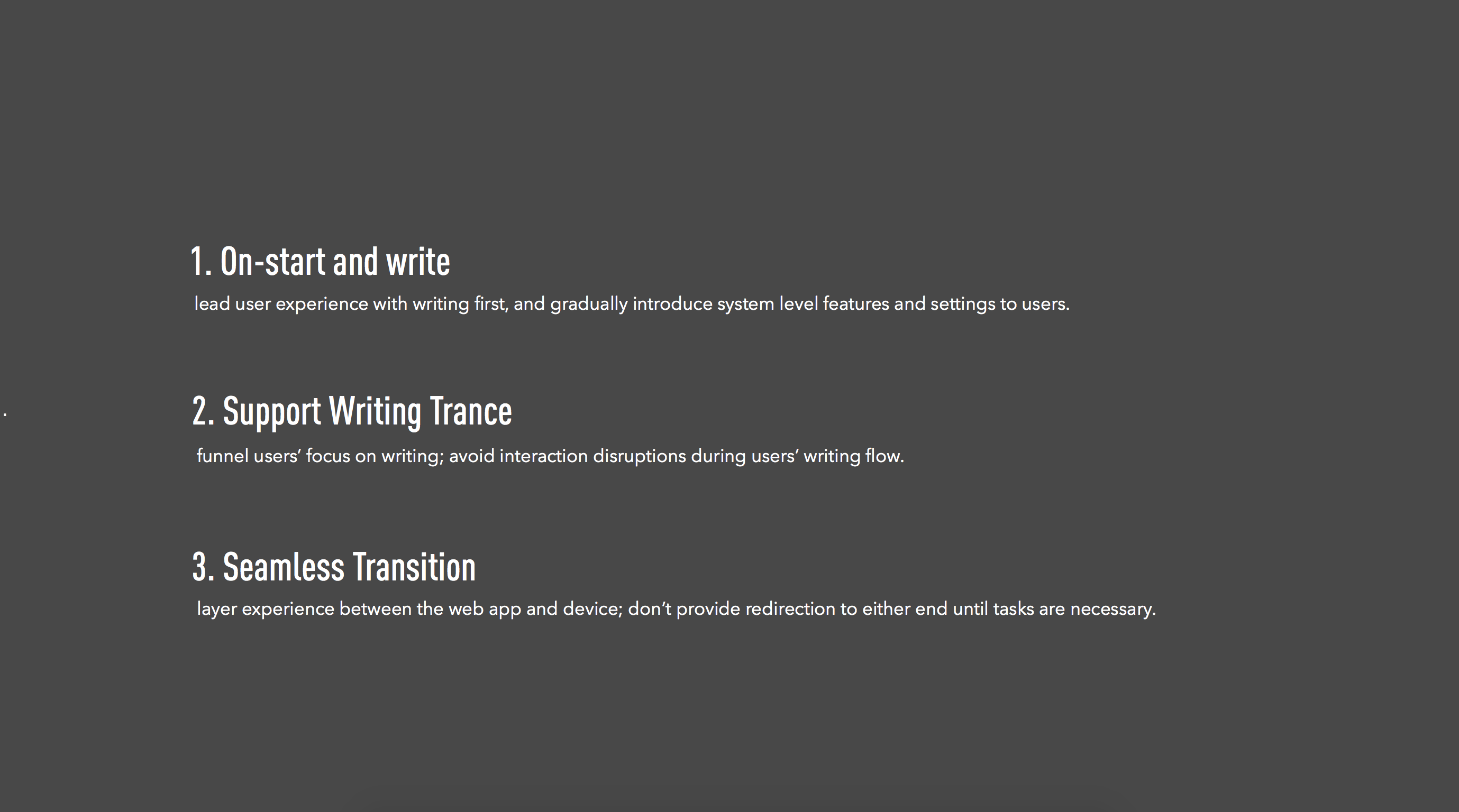
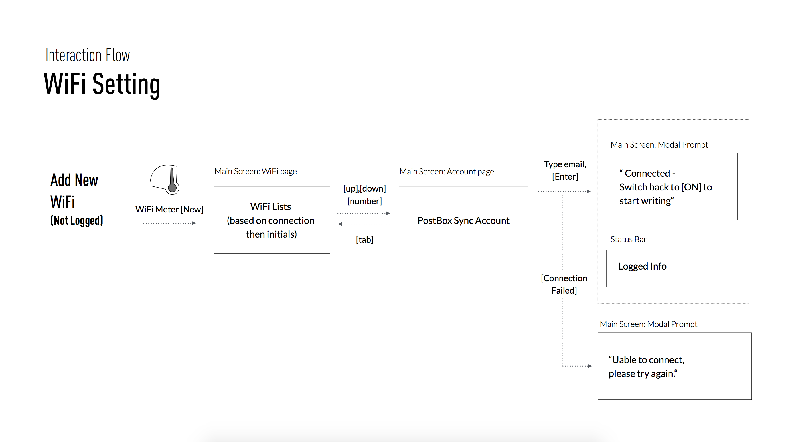
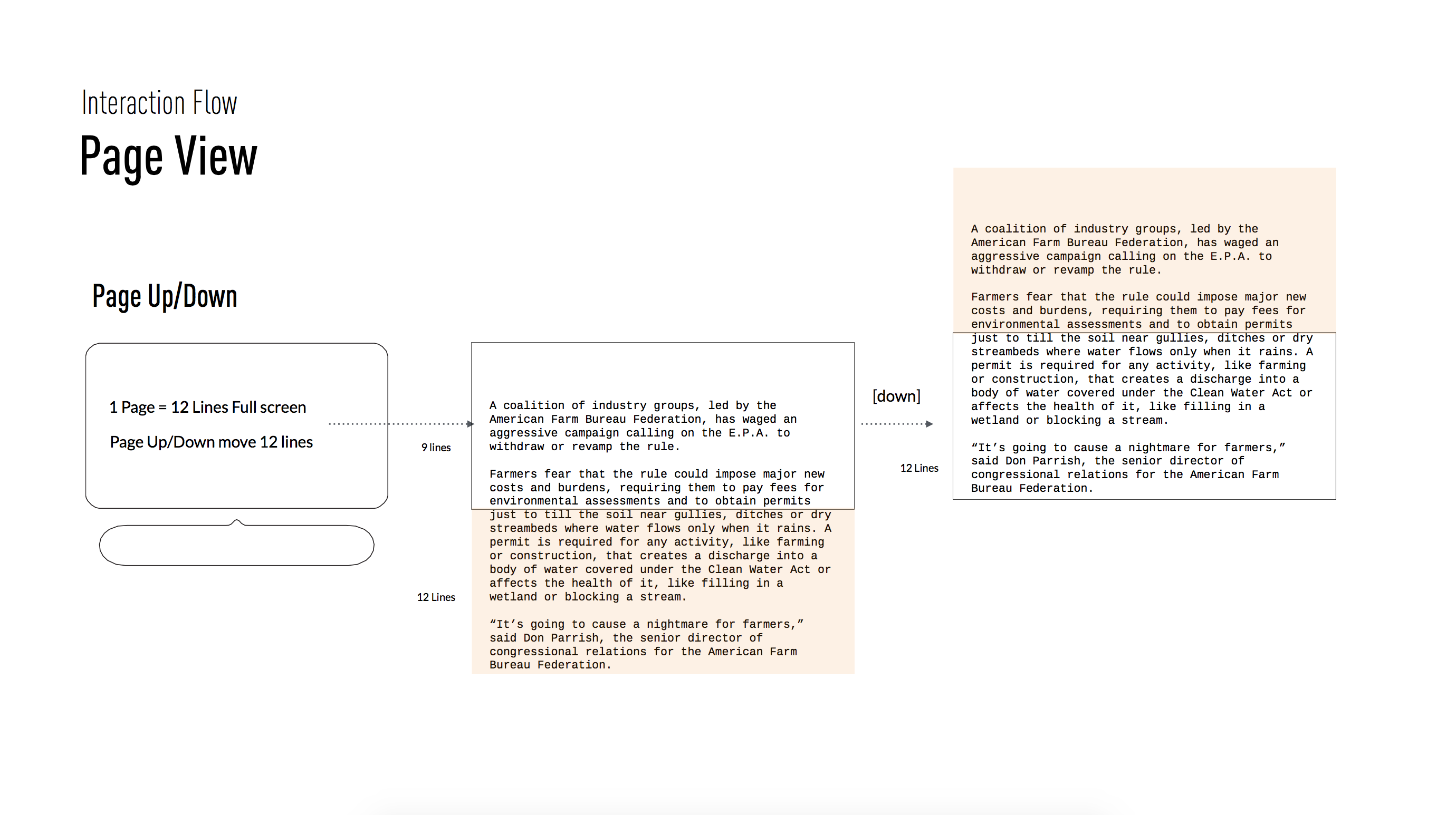
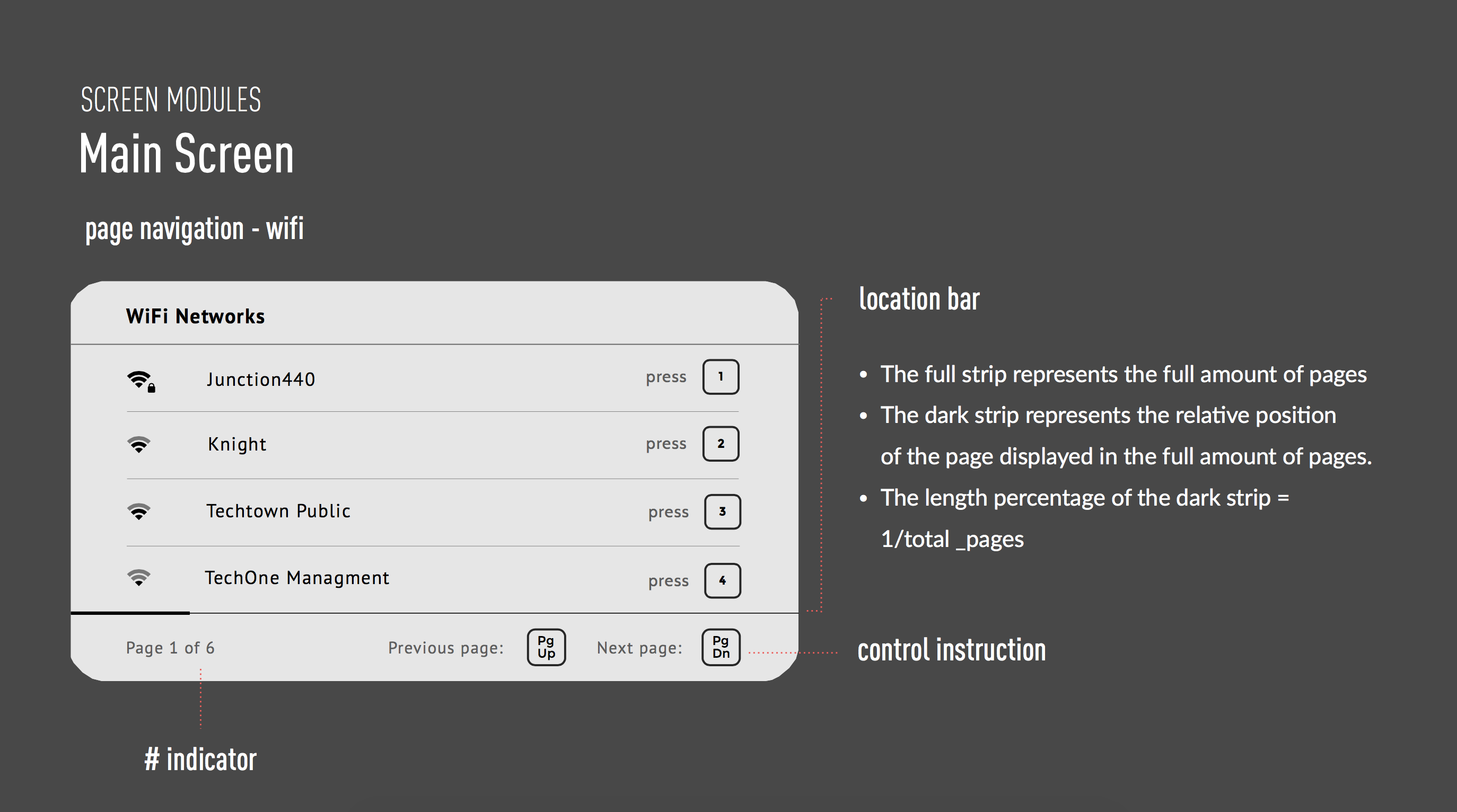
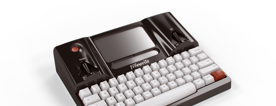
In the summer of 2015, I chatted with the founders of Freewrite, a.k.a. Hemingwrite , and fell in love with their passion of a writing environment with minimal friction and distraction. I went onboard and designed the fundamental interaction experience of the device, with heavy emphisis on set up and writing control. My design helped answer the philosophical questions of the product: How can users “just write” with Freewrite? How can we keep users in the writing trance? How can users write and configure seamlessly? In 2016, the design is shipped with Freewrite, and delights writers with the simplicity and focus:
- TIM POOM, PLATFORM NATION
- MELANIE M., ONCE & FUTURE PODCAST
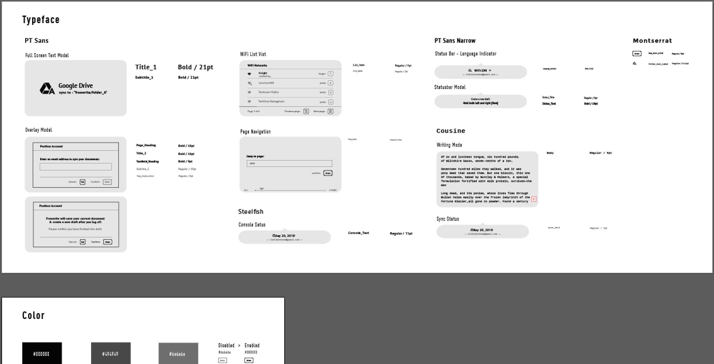
Providing some design samples below while I am still putting together more details on the design problems, user scenarios, and design challenges for this page. Shoot me an email if you want to learn more right at this moment!
